 Malerei mit Druckfarbe auf Aluminium

Objects of art are too complex to be arrayed by quality with certainty. Nonetheless I feel sure, that this painting is one of my best.
Powerful colours show an analogy to the state of mind I was in, when I painted. The painting displays the unique combination of technique and material I discovered and a simple, strictly performed design.
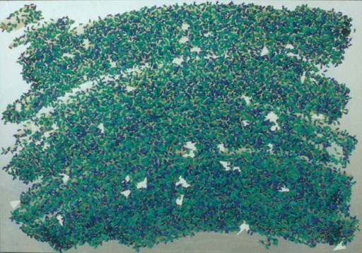
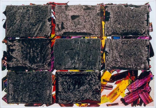
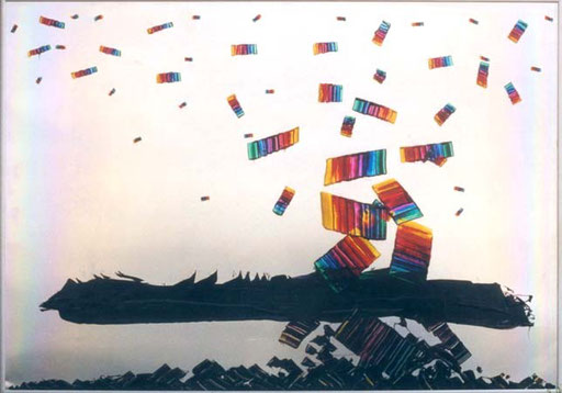
Ford, a big client of our company had us print some hundreds of thousand four-sided Christmas cards. The front and back side were completely blue, the inner pages were completely green with some according text. The kick of the card were small Christmas trees punched out of the title page. The closed card then showed green trees on a dark blue background. The agency, which had designed the card, had made a similar one for itself, that procured the white trees. Printing the cards is a matter of a few hours, punching takes a hole week on the “Original Heidelberg Zylinder”. The little trees, one side blue, the other green, trickled down onto the floor or worse into the machine. Ideally they should have been delivered in slight connection with the sheet and would then have to be pressed out by hand. This is still, I am sorry to say, womens’ work. I can’t imagine what it is like to stand at a table for 8 hours pressinhg parts out of cardboard. The women wre kind enough to save me a big sack full of trees on my appeal. The white trees didn’t need much more than a small paper bag.
Producing the collage was simple. A few broad, wide sweeps of light grey, laid out thickly enough. The plate down on the floor, myself on the table, I let the trees snow. The mess rested there for a week, I took it up, turned it upside down. The trees, which had not been fixed by the adhesive force of the dried ink or could have got a grip on other trees, fell down.
To protect the delicate structure of the collage from physical damage, defilement and UV-light, I shut it up in a box behind a protective glass pane, up to now the most worthy part of the painting.


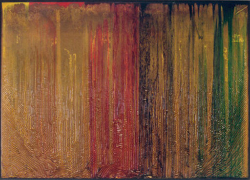
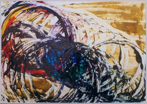
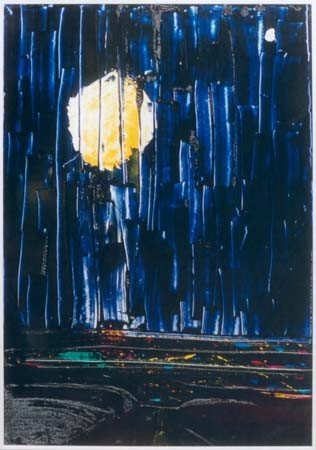
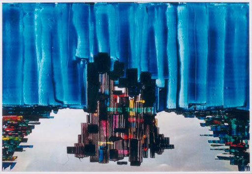
At the end of a Saturday morning shift I had to clean the printing machine. A part of this work was to scrape the leftovers out of the six ink fountains and to put them into an old empty ink pot. I had been printing an AUDI job, which required besides the standard colours yellow, cyan blue and magenta red, silver and varnish on top. Doing such simple, but tedious work leaves an abundance of capacity for the mind to go astray. I observed the different inks blending slowly in the pot. The concept for the painting jumped to my mind. The leftovers filled a 2,5 kg pot, which I took home, poured it all over a printing plate leaning upright against the wall. When the ink was spent and the plate completely covered, I laid the plate down. Only Bärbel and I had the bliss to behold the singularly beautiful, unfortunately short-lived first image of fresh ink: a perfectly smooth plane with a metallic gliss, without the today’s wrinkles, which are the inevitable effect of drying.
Printing ink dries physically by evaporation of volatile components of the ink and chemically by oxydation. Evaporation takes some minutes, oxydation of the thin layer of ink printed on paper takes 8 hours. Developing a skin in an ink pot takes much more time, depending on temperature and colour. One day for orange, three weeks for violet. The thickness of the skin keeps growing until the oxygen molecules are unable to diffuse. The ink below the skin is still printable and liquid, a problem I had to cope with, when I, after several months, put the painting upright. Behind the meanwhile wrinkly skin was a lot of liquid ink (like honey), which slowly sank down and hung in a bag bound to burst. I cut it open, let the superfluous
material drop out. When the cohesive and adhesive forces of skin and ink had become equal to gravitation, the painting was completed.

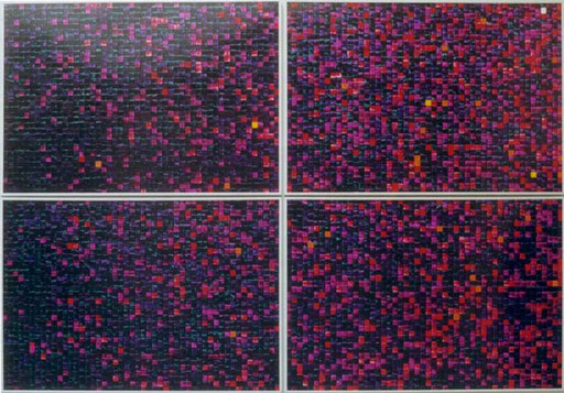
With my two children I went to the toys fair in Essen. At that time my son was deep into role playing games. One booth presented a multitude of different dice (don’t they call them regular polyhedron in geometry?). A cube was just a geometric object for me or marked with points to play dice. Here were “cubes” with 10, 12, 20, 30, even 100 sides. Random generators for special purposes in these games. I bought a “100” and said to my son, I would test it for regularity. Said and done.
I threw the “cube” 7000 times. After every 100 throws I noted how often a number had occurred. I marked the different frequencies with colours. The more a number had occurred, the brighter the colour. Each column represents the frequency of one number. The result is a rough colour composition. Violet (not occurred), blue (once occurred) have the bulk of all. White, the maximum, (seven times) occurred once.
A mathematician, told me, that the number of throws should have been considerably higher to get a statistically reliable result.
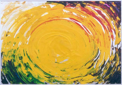
For this second image with a 100-fold polyhedron, I needn't roll dice again, but used the data of the image nr. 36-39. I just arranged the columns of the first image by the size of the sum of the frequencies of their number and marked all in a different colour gamut. Dark blue for low frequency to red, yellow for high frequency.
A gradient was created.


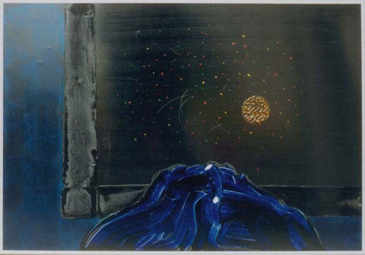
Every now and then in our Printing plant leavings of coloured printing ink, and I don’t mean rubbish, were mixed up and then pepped up by Black, ratio 1:1 to be used for low quality jobs. Composing the Mixture you have to take care that the resulting Black be neutral. One day this job fell on me and I filled 8 20 kg cans. This kind of work was assigned to days of low activity, which were rare. So the cans were had to be set aside before the intensifying Black could be added. Some time later the surface of the ink grew a skin which got more and more wrinkled as time passed. I noticed that not only the hue of the skin differed from can to can but also the structure of the wrinkles. This appealed to me to take some of each mixture home for this painting.


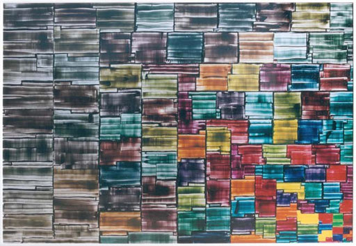
This is a dual development from bottom right towards top left. The size of the color fields increases from field to field by 1 cm², starting with 1. At the same time decreases the saturation of the colors.


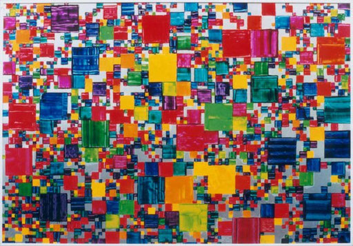
In painting Nr. 26 I have arranged squares by a random algorithm. For this painting I wanted to use my brain as randomizer. I took 12 spectral colours, each of them having the same number of squares for each size. Then I placed the squares “at random”. I was in a quandary. I had to be performer and observer at the same time. Performing required speed and spontaneity, observing meant to prevent my randomizing brain to create patterns or forms. That was stress. So the lower level of the painting was done.
The upper level is a grid consisting of poured out varnish scraped off with a spatula, taking away with it the still fresh ink of thew lower level, thus generating swirls of colours and varnish. The squares get the darker the thicker the remaining layer is.
The random distribution generated by my brain is superimposed by a independent randomness of chaotic turbulence. Therefore the title.

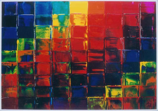
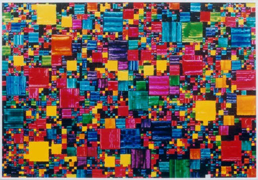
24 primary and secondary colours, each of which takes an equal share of the whole plane. The position of the squares has been set by a random algorithm.


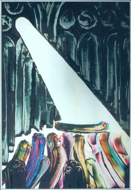
from a novel by John Irving
The painting displays a scene during sunday school. The Children lift up small Owen Meany, balance him on their stretched out arms and let him go around the rows behind the back of the priest. (I don’t know any more, what he was doing with his back on them). The ray of light occurs later in the novel.
For me “Owen Meany” is John Irving’s best novel. I read it to the family.


The colors are: green, cyan, blue, purple, rhodamine, red, orange, yellow. (for all who miss violet, it wasn’t a basic color in Pantone at that time) I placed the small squares horizontally from left top right bottom in spectral order, the large squares vertically. If a large and small square of the same color met, the small field stayed white. As compensation I let black run with the large squares. So, any color could meet with each other. After the small squares were painted and I started with the big ones, I got second thoughts concerning the fixed grid came to me. I decided "on the fly", to let the big fields gradually drop off the grid.


15 years lie between painting Nr. 1 and writing this text. I can’t remember what exactly pulled the trigger in me to paint. What I do remember is how excited I was, when I, a spatula in my left hand, saw the blank mat metallic plane lying before me, surrounded by freshly opened ink pots, each ink emitting its individual scent, and I had to decide, where to put the first dash.
This took place in the printing plant where I was working, not at home, where I painted almost everthing else thereafter. I was alone so it must have been a Saturday afternoon the least sought after shift on weekends.
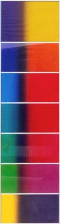
I hadn’t any idea what to paint, the order of the ink pots suggested the action. From left to right I had placed yellow, orange, red, rhodamine, purple, blue, cyan, green and black. I dipped the spatula into yellow. I worked with only one spatula, which I had to wipe clean for each change of colour with a solvent soaked rag. This short interruption supplied the time to let a concept evolve: a rough going around the circle of colours from yellow to blue and off into black with some changing and repeating. A theme I kept working on until today
January 2006