This photo-print is a by-product of the great Sudoku- painting (Nr. 173), generated in the process of painting. I promise You, that I am through now with Sudokus, but this image had yet to be done and what You see came into being as follows. I painted the great Sudoku one color at a time over all 9 plates from top left to bottom right. This meant dipping the spatula slightly into the ink, have a look at the model sheet, looking for the corresponding square in the first line and put the dab, then with a second stroke smooth out the dabbed ink to a colored square. Do this in all 9 lines for one sudoku x 88 sudokus for 1 plate x 9 plates x 8 colors (the 9. color, white needn’t be painted, it is represented by the naked aluminium) yields 57024 dabs and requires 585 hours time. The same time and effort had to be invested into the preparation.(more about the preparation in the text under painting Nr. 171) Back to the dabs. To dab ink with a 1cm spatula into a 1cm² square without transgressing you better dab diagonally. This is simple work and letting the mind wander is inevitable, so that in the middle of painting cyan it struck me, that many dabs looked as if I had drawn something, for example a pipe. Or even if the dab was unremarkable, the following smoothing stroke produced a fullfaced drawing. If I gave these objects a further stroke, they were gone. For some time I regarded the phenomenon as a welcome distraction during tedious work, until the frequence of occurance and the diversity of the forms gave me the idea to do this photo-collage. This meant considerably more time effort, when the deadline of my next exhibition loomed on the horizon. The additional effort consisted of taking pictures whenever a form occurred in the process, which meant drawing the stool to the easel, taking the camera, climb the stool, take one or more pictures, step down, put the camera away, push the stool away, going on painting. I took more then 400 pictures from I choose 200 which I could classify with a good conscience as concrete drawings of things.

Quaint about this graphic is, that it is a byproduct of a large painting which I finished 9 months later, so to explain the former I have to explain the latter and on top to go back to two earlier paintings, Nr. 150 Sudoku and Nr. 151 Periods of 2008.
Painting Nr. 150 Sudoku is a colored representation of 88 (solved) Sudokus. Painting Nr. 151 is a colored representation of periods of prime numbers by assigning a color to each digit.
Both paintings are closely related. “Sudoku” shows a surprisingly homogeneous colored throng, “Periods” shows a development from pattern to irregularity.
Before I could begin to paint I had to tackle a problem. “Sudoku” requires 9 colors for 9 digits, “Periods” 10 of them with white for zero. I wasn’t happy about white occuring only in one of the paintings because of it’s predominance. To evade this I decided to replace cyan by white in “Sudoku” assuming that the remaining blue and violet would be sufficient for the bluish part. The decision was right, still the effect of the missing color could not be ignored. I kept this imbalance in my mind.
Eventually in 2012, probably while doing a sodoku, I got the idea how to solve the imbalance problem: I just had to paint 8 more “Sudoku” paintings with each color once missing and so I did.
It began with assembling the template, that is collecting, solving, scanning 704 sudokus and arranging them with Photoshop, which was a lot of drag & drop work for it is not so easy to place two sudokus against each other without having two same digits side by side. The mouse clicking got me a tennis elbow. After some time I noticed a peculiar irregularity of the overall appearance of the templates. The source of the sudoku collection were my daily and weekly newspapers but taken as lay-out sketches you couldn’t imagine a greater difference in printing quality. WAZ applies two colors for the solution grid: red for the given digits, grey for the digits to be found, printed in from day to day varying quality. The sudoku in the ZEIT-Magazin is presented in finest gravure printing quality. The scans in black & white mode looked accordingly. At last I assembled all 8 templates into a big one, I liked what I saw and gave it to White Wall to print.
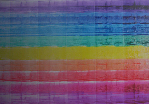
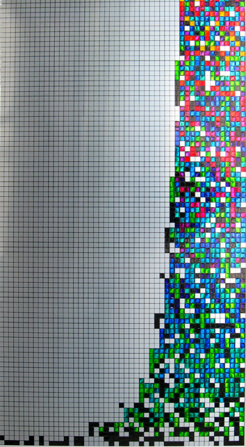
Painting with printing ink on aluminium printing plates means working on its matt polished backside. For this painting I used the specially coated front side into which a laser burns and chemicals wash out the form. Usually this side is inapplicable for me. With this place it was different because of the form, a screening gradient of vertical stripes 10 cm wide with rising values from right to left. Onto this form I rolled ink. The roller puts on a layer gradually decreasing from right to left, whereas the underlying grey is increasing. As printing ink is translucent, the overall effect is a gradient into grey.

This painting is the last one in a series of 5, connected by a close artistic relation and these are their numbers: 130, 157, 163, 164, and 168. Painting 130 gave the impulse. It consists of 70 squares, 10 by 10 cm, roughly screened, the coloring of the small squares is generated randomly under several restrictions. Painting 157 replaces the 10 colors of the first painting by combinations of the three basic colors: cyan, magenta, yellow. Black and white remain unchanged. Painting 163 shows the same colored squares as in 157, but as full tones, the 70 recipes are given by the color values in 157. Nr. 164 is painted from the leavings of Nr. 157 after having been poured into an empty ink can. Painting Nr. 168, the last one, is a collage of 70 postcard sized clips. These are cuttings from the protective underlays on which I mixed the 70 recipes für Nr. 163. The clips show the constituting colors and the resulting color and their position is in accordance with the positions the color squares in the previous paintings.

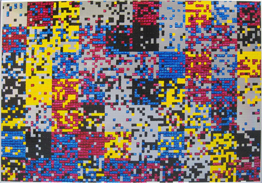
This painting is a variety of Nr. 130. Black and white squares are the same in quantity and positioning. The coloring is reduced from 10 to the 3 basic colors, cyan, magenta, yellow.
The scanty impression of the painting is due to the gross “screening” of 2,54 px/in for it would take 300 px/in at least to let green appear from cyan and yellow. Though, the farther away you are from the painting the more colorful it will appear.
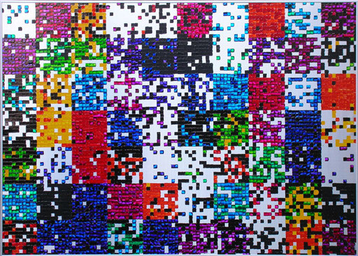

To be seen are numbers the digits of which are coded by colours. Each row represents one number. The upper 13 are base 13 numbers. The following 12 are the same as above, but they are converted in base 12 numbers. The 13th number has been omitted. Accordingly the number of colours is reduced by one, yellow. Of these 12 numbers the first 11 are converted to base 11 represented by 11 colours. This continues until the first two numbers and only two colours are left, black for 1, white for 0. I did the converting by MS-Excel and the biggest number the software could handle was:
287020046812233 in base 10 or
C41CB49A34797 in base 13 or
1000001010000101100001111111011110000010001001001 in base2.
Stephan Wolfram, mathematician, physician, computer scientist, has inspired me to this painting by his book “A New Kind of Science” *. I came along him during the research for my painting Nr. 158 “Langton’s Ant on my Face”, which is about a so called cellular automaton. In his book Stephan Wolfram presents the deeply erudited hypothesis that our universe in all its complexity develops according to very simple rules as in a cellular automaton,
*numbers in different bases are dealt with in the book on page 116 ff.

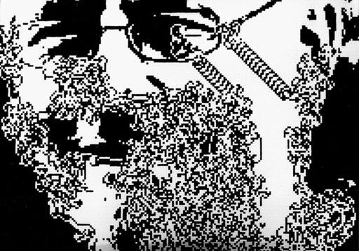
Reading „The Collapse of Chaos“ by Jack Cohen & Ian Stewart (USA 1994) inspired me to this painting. The Book deals with the paradox relation between simplicity and complexity of the world and our thinking. As an example may serve “Langton’ Ant”, a simple cellular automaton, named after its inventor Christopher Langton.
“The ant moves either horizontally or vertically on a square grid of black and white cells following three simple rules:
1. if it is on a black cell it makes a 90° turn to the left.
2. if it is on a white cell it makes a 90° turn to the right.
3. as it moves to the next square, the one that it is on changes colour from white to black or the reverse.
The ant scurries around producing a chaotic, though determined pattern until it gets locked into a cycle that repeats the same sequence of 104 moves whose overall result is to move it two squares diagonally. It continues like this forever systematically building a broad diagonal “highway”. This behaviour is curious enough, but computer experiment suggest something even more striking. If you scatter any number of black squares around before the ant sets off, then it still ends up building a “highway”.” (p. 212 f, Penguin Ed. 2000)
That brought about the idea to let the ant run all over my face. My friend Michael Plein gets the credit for doing all the graphic and programming work. The original photo was reduced to a low resolution black/white, which the ant could start on. After 100.000 steps the graphic was completed. I blew it up to 70 x 100 cm with 28.000 squares 5 x 5 mm and set myself to painting.
The “highway” occurs even two times.


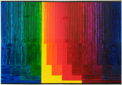
The colors which we paint and print with give us the impression of color by filtering parts off the white light according to their specific chemical structure, hence the term “subtractive mixture”. Mixtures of the basics cyan+magenta, cyan+yellow, magenta+yellow generate the so called secondary colors, adding the third basic causes blackening.
The painting shows from bottom to top the progressing furcation into the secondary colors. Above black the three basics, above the first intermediates and so on. Above the top 48 intermediates once again black. All rectangles are commensurate.The mixture ratio of neighbouring colors is 1:1 leading to an even transition from color to color. This is not true for yellow, which dominates by its brightness.
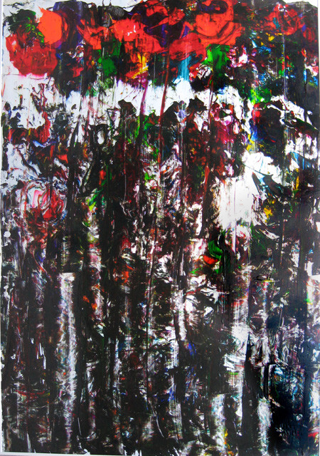

This a colored representation of the periods of prime numbers. The length of the period of a prime p is p –1 with a peculiarity that some primes have several periods. For example the periods of 11 are 0/9, 1/8, 2/7, 3/6, 4/5. In these cases the sum of the periods is p – 1.
In the painting every row shows the period of a prime arranged from short to long periods, generating increasing irregularity.
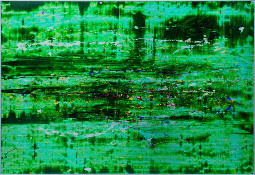
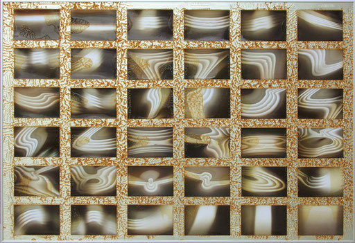
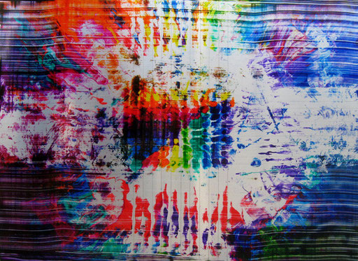
In my workshop, above my easel, four neon tubes are mounted parallel below the ceiling. I took fotos from their reflection by an aluminium plate. The plates are 0,3 mm thick and easily to be distorted. It is remarkable that the first foto, top left, reflects the 4 tubes horizontally, whereas the last one, bottom right, vertically. A common mirror if turned, does not rotate the reflected image as is here the case. The reason for this is the matte brushed surface of the aluminium. The photos are fixed on the plate by varnish.
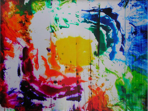
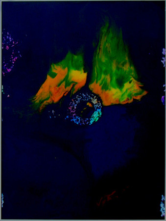
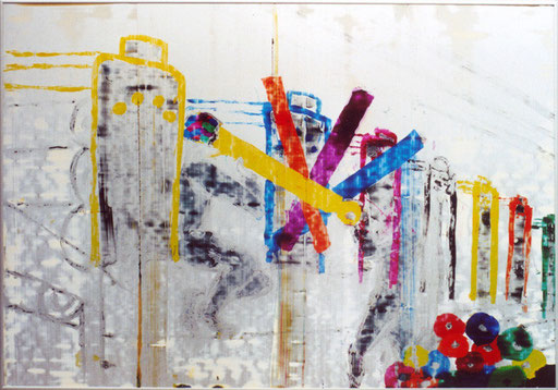

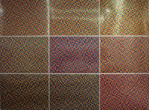
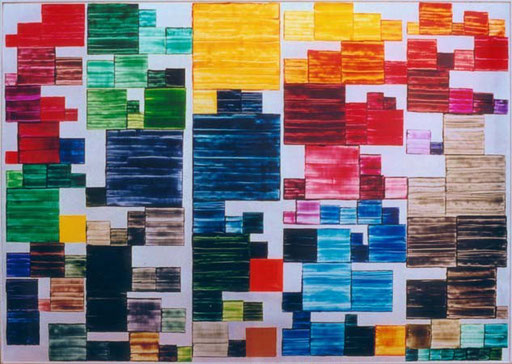
I wanted to create a gradient, in which twelve spectral colours run into each other, crossed diagonally by a black-white gradient. Despite an image size of 400 x 210 cm, resolution of course is rough. Thus the erratic random placement is in the foreground, while the underlying random distribution generating the "continuum" of the Gaussian bell shape is not visible to the eye. Our brain realizes in the jumble of colorful squares a gradient. We interprete an continuum, where only discrete elements logically and physically exist. Extremely high resolution in my two posters Nr.1 and Nr. 2 are shown, but here also there are discrete elements, the molecules of the color pigments, which constitute the gradient. And even the finest gradient we know, the spectrum of the rainbow, is no Continuum, but random distribution of light quanta. So what is a continuum?
A color field is the size of 3 x 3 cm. The whole picture consists of 9.108 squares. Each color square has taken one of fourteen possible shades randomly. The colours are: black, white, yellow, Pant. 123, Orange, red, Magenta, purple, violet, blue, cyan, green, Pant. 375, Pant. 396.
If the partial probabilities for all colors in all squares were the same, a colorful, chaotic image would be the result. Only the change of one or more partial probabilities leads to the favor of a hue at the expense of the other and gives the possibility of coloring and designing a form while maintaining the randomness of the "bigger picture" (Stochastic screening)
So I had to define fourteen probability functions each with one relative maximum and petering out towards the limits to zero. All colors in the entire image equally likely to occur, the area integrals of all fourteen functions have to be equal. The maxima of the colours are on a diagonal through the origin, the maxima of white and black over the vertices of intersecting diagonal.
The normal distribution function is best suited for the purpose of this design. By varying the parameter sigma all volumes could be levelled. The formula for the density function of the normal distribution of two random variables is shown below.
Unfortunately I had to settle this with a solution by computational approach, since an exact mathematical solution does not exist.


to paint this painting I have been inspired by the book “The Burgess Shale and the Nature of History” by Stephan Jay Gould. Good popular science books always fascinated me, as there were: “Im Anfang war der Wasserstoff” (In the Beginning there was Hydrogen) by Hoimar von Dithfurt, „A Brief History of Time” by Stephan Hawkins or most cherished of all “Gödel, Escher, Bach – An Eternal Golden Braid” by Douglas R. Hofstadter, “The End of Time” by Julian Barbour, “What Evolution is” by Ernst Mayr.
These books introduced me to scientific fields, I had not much heard about at school.

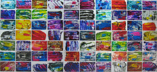
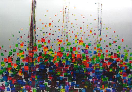
By the 17.05 up to 31.05.2003, I took part in the cycling trip "Gusti Zollinger-Euroride" from Calpe to Bern. The trip went in 13 stages and about 1,900 km from Spain to Switzerland. During the ride I took mental pictures, which I tried to memorize in the evening of each stage and took down notes for later use. I painted the individual impressions as postcards. From the natural impression only the colours and their arrangement remained.

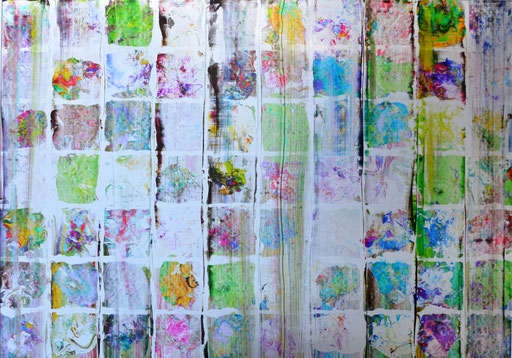
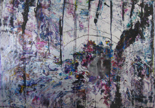
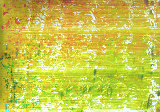
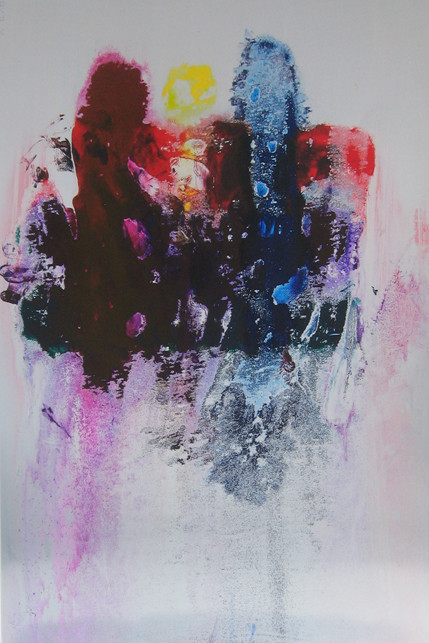
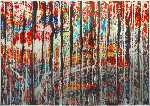
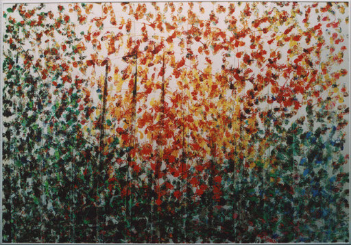
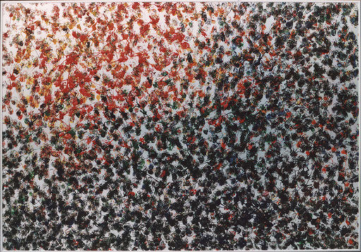
This painting is a recycling of leftovers of printing ink used for painting No.50. For nine years the small paint cans have been standing on the shelf, sorted according to their Pantone number. I then decided to dispose of them. However, when opening the cans the ascending scent triggered an idea. Rather than fill the remains in a large garbage can, I slapped the remains one after the other on a plate and filled the vacancies with varnish. With a second plate laid on, I squeezed everything flat, pulled off that plate and scraped everything off. An echo of the order described in painting No.50 may be seen.

 Malerei mit Druckfarbe auf Aluminium

